
OBOI
About the project
Oboi Burguer & Grill is a Brazilian premium smash burger and artisanal hamburger brand built to compete visually and emotionally in one of the most crowded food delivery markets in the country. The brand was conceived to launch strong on iFood, establishing an immediate sense of quality, personality, and desirability before the customer even sees the product. With future expansion plans into a full grill line, the identity needed to be strong enough to anchor a brand that would grow beyond its origins without losing its core character.
The strategic challenge was to create a visual identity that communicated premium quality and urban sophistication without falling into the traps most burger brands succumb to: literal bull illustrations, caricature mascots, exaggerated Texan aesthetics, or the generic visual noise that makes most delivery profiles look identical on a screen. The brand needed to feel like a place people trust before they have ever tried the food, and memorable enough to be recognized instantly at thumbnail size on iFood.
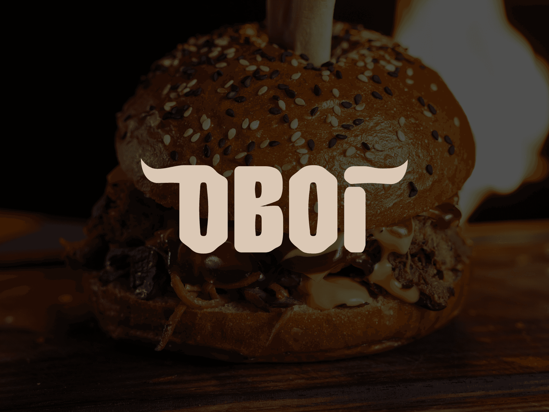
The identity development process began with a central creative challenge: how to reference the brand's connection to beef and grill culture without resorting to obvious iconography. The solution was to integrate the element directly into the typography itself. The horns were not added as a separate symbol but born organically from the letters of the wordmark, emerging from the D and the T as natural extensions of the letterforms. This approach transformed the word OBOI into the symbol, eliminating the need for a separate icon and ensuring the brand name always remains the protagonist of the identity. The typography was fully customized with its own geometry, designed to hold its character at reduced sizes on delivery apps while carrying enough weight and presence for future facade and packaging applications. The color palette was built around deep dark brown and warm beige, tones that evoke meat, embers, craftsmanship, and appetite simultaneously, with strong contrast that performs equally well on dark and light backgrounds across every application.
The final solution resulted in a cohesive and highly distinctive visual identity, where typography and concept are inseparable. The mark does not describe what Oboi sells. It embodies how Oboi feels: strong, urban, confident, and impossible to ignore.
With the new identity, Oboi gained the visual authority to compete with established premium burger brands from day one, positioning itself as a brand that looks like it has already earned its reputation. The project delivered not just a logo, but a complete brand character capable of scaling from a delivery profile icon to a full restaurant facade without losing a single ounce of its personality.