
Grano
About the project
Grano is a Brazilian specialty coffee brand built around a simple but powerful belief: that a truly exceptional cup of coffee is not just a beverage, it is a moment. The brand was created to position itself in the specialty coffee market as an authentic and memorable presence, one that communicates quality, origin, and craftsmanship through every visual touchpoint, from the logo to the packaging that reaches the consumer's hands.
The strategic challenge was to develop a visual identity strong enough to stand out in a market where most brands either lean too heavily on rustic aesthetics or lose their personality in generic minimalism. Grano needed to feel premium without being cold, natural without being amateur, and distinctive without being loud. The identity had to work as hard on a shelf as it does on a social media feed, carrying the same emotional weight across every surface it inhabited.
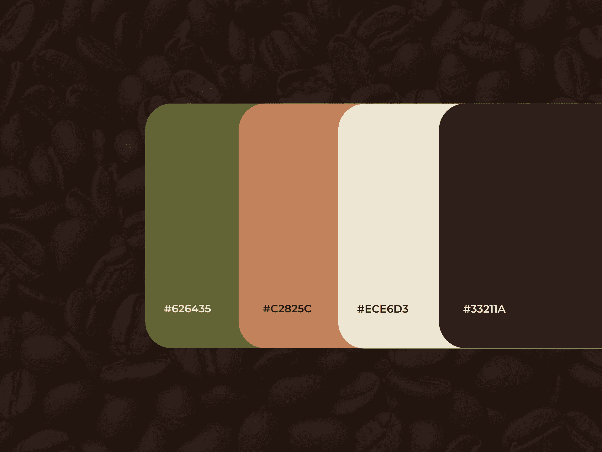
The identity development process involved researching the intersection between specialty coffee culture, organic design language, and premium packaging aesthetics. The typography chosen for the wordmark carries an organic elegance, with a distinctive curl on the final letter that adds personality and movement without disrupting the overall sophistication of the composition. It feels handcrafted and intentional, referencing the artisanal nature of specialty coffee without falling into obvious clichés. The symbol, a delicate arrangement of coffee leaves and a bean at its center, was designed with thin illustrative lines that feel botanical and refined, elevating the brand beyond conventional coffee iconography. The packaging design extends this language through detailed botanical line illustrations across the base of the pouch, creating a visual richness that rewards close attention while maintaining overall elegance. The color palette, built around a deep olive green and warm copper tones, was chosen to communicate naturalness, sophistication, and warmth simultaneously, a combination that is rare in the category and immediately sets the brand apart on shelf.
The final solution resulted in a cohesive and expressive visual identity, where logo, symbol, typography, color, and packaging design operate as a single unified language. Every element communicates the same core idea: that Grano is more than a coffee, it is an experience worth slowing down for.
With the new identity, Grano gained the visual authority to compete in the specialty coffee market with confidence, positioning itself as a brand that values origin, craft, and the ritual of a well-made cup. The project delivered not just a logo and packaging, but a complete brand world with the personality and consistency needed to build lasting recognition and loyalty.