
Ponto Nexo
About the project
Ponto Nexo is a Brazilian D2C home decor brand specializing in premium decorative objects and high-end lifestyle products, targeting contemporary consumers from classes A and B who see their living spaces as an extension of their own identity and personal style. The brand's goal was to position itself as a digital curator of sophisticated design, inspired by Japandi and Scandinavian aesthetics, conveying serenity, elegance, and quiet luxury while distancing itself entirely from the generic visual language of conventional e-commerce.
The strategic challenge was to build a visual identity that translated the brand's premium positioning into a cohesive and distinctive system, capable of competing visually with international lifestyle references such as Muuto, Zara Home, and Menu Copenhagen. It was necessary to transform concepts of balance, continuity, and organic sophistication into visual elements that elevated the perceived value of the products, making even a functional household item feel like an exclusive design piece.
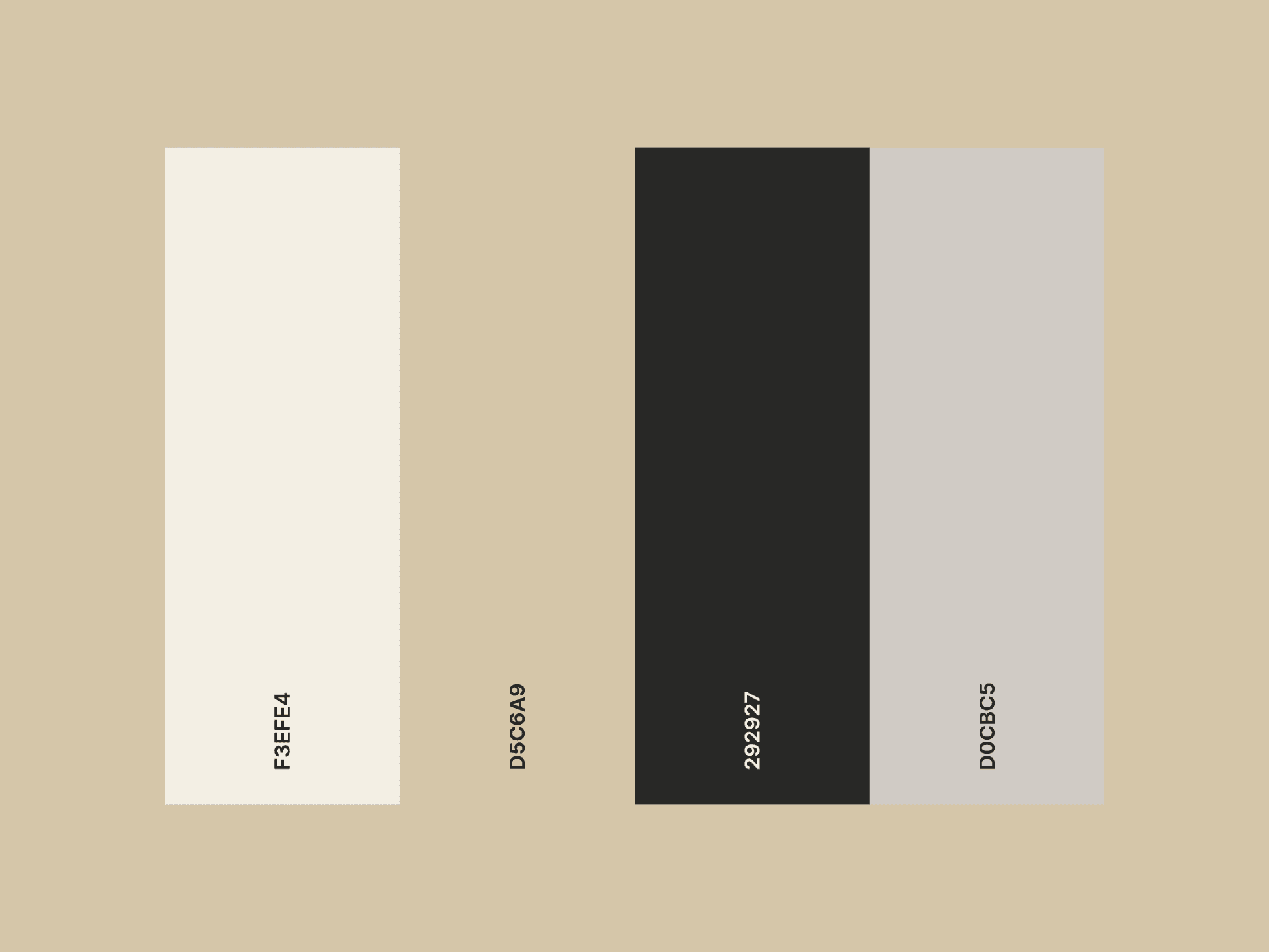
The identity development process involved deep immersion into the Japandi and Scandinavian design universes, competitor analysis, and typographic research aligned with the brand's positioning. A geometric sans-serif typeface, Albert Sans, was selected for its clean lines and absolute absence of ornamentation, the typographic language of contemporary Scandinavian luxury. Precise kerning work was applied to create generous letter spacing, reinforcing the visual silence and breathing room that define the quiet luxury aesthetic. The symbol was developed from pure geometry, composed of two concentric open arcs derived from the circle, a form central to Japanese design philosophy, representing balance, totality, and continuity. The open arcs were intentionally left unclosed, communicating movement, expansion, and growth. The color palette was built around warm neutrals, off-white, sand, warm grey, and matte black, calibrated to harmonize naturally with the photographic language of Japandi interiors.
The final solution resulted in a cohesive and sophisticated visual identity, where typography, symbol, and color palette operate as a unified system, each element amplifying the others. The brand was designed to disappear into its context, to feel like it belongs to the environments it inhabits rather than being imposed upon them, creating the visual calm and sense of belonging that the brand's audience seeks in their spaces.
With the new identity, Ponto Nexo gained the visual authority necessary to position itself as a premium digital lifestyle brand, capable of elevating the perceived value of its products and establishing genuine differentiation in a saturated market. The project transformed the brand into a visual and emotional experience, where every touchpoint communicates sophistication, curation, and the quiet confidence of a brand that knows exactly what it stands for.